Showing posts with label Printmaking. Show all posts

Tuesday, April 28, 2015

Odd, off, oft, old.


The artist and printmaker Annie Bissett has discovered this wonderful bit of found poetry, which she has posted on her Tumblr blog. Adapted from Thomas Dilworth's A New Guide to the English Tongue, an oft-reprinted 18th-century schoolbook, it reproduces part of a table of "Words of Three Letters, viz. One Vowel and two Consonants."

Although it may not be immediately apparent, there is a logical order to the table. It is alphabetized first by last letter, then by central vowel, and finally by first letter. The first word in the table (which actually begins at the bottom of the unshown preceding page) is Dab, and it is followed by Web. Bib fib nib rib. and so on until it reaches Box sox. It then begins again with words that don't fit the consonant-vowel-consonant spelling pattern: The. Who. Cry dry fly etc. (although Two., in the second paragraph, would seem to belong further down). The words in parentheses appear to be ones whose vowel is pronounced differently from those of the rest of their respective groups. The book uses the old-style ſ for initial s.

But knowing how the table is constructed is much less fun than simply reading it (especially aloud), enjoying the music of English speech sounds, and reflecting on the strangeness of human language. It may remind us that these everyday words, the essential building blocks of English, are, in the end, just arbitrary signs, ones that would mean nothing, or perhaps different things, to someone who knew nothing of the language.

Saturday, March 01, 2014

Keisuke Serizawa: 1969 Calendar


This hand-printed calendar was produced by the Japanese katazome (stencil-dyeing) master Keisuke Serizawa, whose mark can be seen just below and to the left of the bird on the cover print (see following image). He produced calendars, with different designs each year, from 1946 until the mid-1980s; at least one associate and friend, Takeshi Nishijima, produced his own similar calendars during part of that period.


This particular production is relatively restrained. On most of the individual panels it is the numbered squares or circles, rather than the accompanying illustrations, that are the dominant design element; many of the spaces not needed for dates are filled with little vignettes.


For the August print below, Serizawa worked the letters of the name of the month into the first row of the calendar, but since he was one square short he combined the last two letters into one space.


November, I think, is my favorite. Notice that the "S" for Saturday is displaced to a line above the other days, again because there was no empty square available for it.


All of these pages were printed on handmade paper, so the originals are not as neat and square as the images shown here imply.

A variant of this calendar has the name of the Western Automobile Co., Ltd. (the Japanese affiliate of Mercedes-Benz) printed on each page; the image below is from an auction listing.


I am relying on George Baxley for identification on this calendar as the work of Keisuke Serizawa. There are relatively few English-language sources on the artist, with the fine exhibition catalog Serizawa: Master of Japanese Textile Design (Yale University Press, 2009) being the notable exception.

Sunday, April 07, 2013

H. N. Werkman


Alston W. Purvis's volume in Yale's Monographics series brought this interesting Dutch printmaker to my attention. Hendrik Werkman was born in Leens in the Netherlands in 1882 and lived most of his life in the city of Groningen. A professional printer, he apparently didn't have much of a head for business, but he did have a rich talent for design and typographical experimentation. Though he became associated with a Dutch art circle called De Ploeg (The Plough), he retained a prickly independence, and his work was not widely distributed or recognized during his lifetime. One of his best-known projects was a kind of chapbook periodical entitled The Next Call, much of which (there were nine installments, some printed on a single folded sheet) is reproduced in Purvis's book. He was particularly adept at using found materials and printing furniture as elements in his work; in the image immediatly below, for example, the black element was printed using the key plate from a door.


Prolific and resourceful even in the face of difficult circumstances, he created a series of some 600 monoprints that he called "druksels," a name derived from the Dutch drukken (to print), for calendars, bookplates, and other ephemera, and for a suite of prints illustrating stories from Martin Buber's Chassidische legenden (published as Tales of the Hasidim in English). Though Werkman was not Jewish, these last, published under German occupation in 1942, may have contributed to his arrest and execution in March 1945, just days before the Allied liberation of Grondingen. A substantial portion of his work, which had been seized by the Nazis at the time of his arrest, was destroyed during the fighting for the city. Fortunately, much of it remains.


Purvis's H. N. Werkman seems to be the best current source on the artist's life and work. There is a substantial online collection at the Groningen Museum and a nice selection at www.druksel.com.

Saturday, November 24, 2012

More Katazome


According to the label, these katazome (stencil-dyed) calendar pages were "made by Haruo Kuriyama in Kyoto" and distributed by Yasutomo Co. in San Francisco. The artist who designed them, however, is almost certainly Takeshi Nishijima. The page for February is missing from this set.


Click on the katazome label below for earlier related posts.

Sunday, April 17, 2011

Thomas Bewick


In our image-saturated culture it may be hard to imagine a time when the average European's exposure to visual representations of the world might be limited to tavern signs, decorations in churches (where these were not proscribed), and the crude illustrations of chapbooks and broadsides, an era before photography, lithography, and their digital successors made possible the routine mass-production of pictures. Thomas Bewick's oft-reproduced wood engravings may appear quaint and bucolic to us now, at least at first glance, but in their day they represented a revolutionary advance in the production and marketing of images. For much of his audience, Bewick's depiction of the wonders of nature was a revelation.

Bewick was born in 1753 in a village a few miles west of Newcastle upon Tyne. By his own account he was a fairly incorrigible youth, given to pranks and outdoor escapades and subject to canings for his misbehavior. His saving grace was an early acquired fondness for drawing, his stroke of good fortune an apprenticeship to the Newcastle engraver Ralph Beilby, later his partner. Under Beilby's stewardship he took on a variety of metal engraving tasks, but it was his knack for the relatively novel technique of wood engraving that brought him renown and a good living for the rest of his long and largely fulfilling life.

Unlike traditional woodcuts, wood engravings use sections of wood -- boxwood from Turkey was the preferred source -- that are sliced across rather than with the grain. The resulting blocks are small but tough, and a skilled hand like Bewick's could achieve fine detail that could otherwise only be obtained through the more expensive metal engraving techniques.

The three images below are from Bewick's illustrations for The Fables of Aesop and Others (1818). Though confined within strict borders, they display vivid naturalism -- the result of the marriage of technique and first-hand familiarity with the countryside -- and a flair for drawing out the personalities of his subjects.


For Bewick's most famous productions, his illustrated natural histories of quadrupeds and birds, the borders were shed, allowing his subjects to come right up to the viewer's eye.


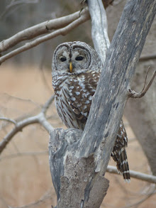
In printing the great natural history works, Bewick engraved a series of tail-pieces (or "tale-pieces," as he called them, with deliberate wordplay), intended to occupy empty spaces at the end of a chapter. These rustic slice-of-life scenes afforded Bewick an opportunity to make subtle satirical or moral statements that can be easy to miss with a cursory glance. Bewick was in his day what might be called a moderate radical, sympathetic to political reform movements, to the Scots, and to those displaced by enclosures, skeptical of sectarian creeds and war makers. In one "tale-piece," entitled "The Proper Use At Last of All Warlike Monuments," a jackass rubs its posterior against an inscribed pillar leaning over in a field.

Many of Bewick's pictures have been endlessly reproduced and are widely available on the web, but the number of high-quality scans is surprisingly low, especially for the "tale-pieces." (Bear in mind that the original blocks were often only a few inches tall.) I was unable to find good versions of the illustrations Bewick created for Oliver Goldsmith's poem "The Deserted Village" ("Ill fares the land, to hast'ning ill a prey, / Where wealth accumulates, and men decay;"), and only one of the copper engravings Bewick executed for Matthew Consett's A Tour through Sweden, Swedish-Lapland, Finland and Denmark.


With the exception of the reindeer, the images shown here are from the galleries of the Bewick Society, which also publishes a blog entitled Tale-Pieces. The Edmonton Art Gallery has a fuller selection with, unfortunately, fairly poor scans.

In the end, though, Bewick's engravings are best appreciated as they were intended to be seen, on paper, and fortunately, there are various collections of his work, ranging from inexpensive paperbacks to budget-breaking limited editions. Two years ago the Ikon Gallery published a hardcover catalogue of the first comprehensive exhibition of the "tale-pieces," and for those with deep pockets Nigel Tattersfield's three-volume Thomas Bewick: The Complete Illustrative Work will be published by the British Library and Oak Knoll Press this month.

Jenny Uglow's Nature's Engraver, the most recent biography of Bewick, has a number of illustrations, as does printing historian Iain Bain's definitive edition of the artist's posthumously published Memoir (Oxford University Press, 1975 & 1979), which is recommended both for its unaffected charm and as a valuable record of rural life and workshop practices.

Wednesday, December 01, 2010

December


Katazome (stencil-dyed) calendar page by Keisuke Serizawa (1895-1984). (Scanned from a commercially issued reproduction.)

Wednesday, February 10, 2010

Snow


Some seasonally appropriate images by the printmaker Kawase Hasui (1883 – 1957), via the extensive online galleries of the Los Angeles County Museum of Art.