The first edition of Julio Cortázar's novel Rayuela (Hopscotch) was published by Editorial Sudamericana in Buenos Aires in June 1963. During the planning of the book the author and his publisher, Francisco Porrúa, had extensive discussions about the cover art, documented in a series of letters that are reproduced in the first volume of the Alfaguara edition of Cortázar's letters.
The idea of using a drawing of a hopscotch grid as part of the design apparently originated with Porrúa. In a letter of October 8, 1962 Cortázar wrote that he planned to visit bookshops in search of, among other things, a book of Brassaï photographs that Porrúa had indicated might contain a picture of such a pattern. He also promised to send his publisher a sketch, photo, or plan that could be used as a model for the cover art. Later (March 13, 1963) he sent a photograph, and also sketched out in his own hand a rough plan in which the hopscotch game would be laid out horizontally across the front, back, and spine of the book, with the title superimposed across the portion that appeared on the front. He also mentioned that a friend and compatriot, the painter Julio Silva, was working on a mock-up, which Cortázar promised to forward to Porrúa when it was ready.
Porrúa suggested that the rayuela be rotated ninety degrees so that it would appear full-length on the front cover. Cortázar responded at length on April 1:
And now we're going to put the cover on the book. So you've been studying the thing with Esteban and, for one brief moment, thought that the hopscotch would be better standing up? Enormous cronopios, I started out that way as well and I had it standing up for along time until the poor thing's Earth got tired. No, my friend, I don't think that will work. It won't work, as you have seen very well, because that front cover has its other side, and I would prefer if possible that it not have a front and a back. You detect an unfortunate implication in the Heaven on the back of the book, and it's true, but there's more to it than that. Very briefly, imagine that, making a praiseworthy sacrifice, you have just purchased a copy of Rayuela, and without wasting a moment you have immersed yourself in reading it. If you are a normal person, you will hold the book with your left hand, while your right hand will occupy itself with turning the pages, while going back and forth with your pipe, alternatively taking sips of the Mariposa brandy that your wife has served you, and from time to time you will make a signal of admiration that stirs the air in your home. Fine, so here we are with your left hand holding the book. Part of your palm and the base of your fingers are resting on the cover, that is to say, on Earth. But the most spiritual part of your hand, the fingertips, the thirst and desire that dwell in your fingertips, will be on the other side searching for Heaven, perhaps grazing it even, briefly entering it. Can you picture it? Your hand is reading the book as well, with that extra-retinary vision of which the sages speak, and which in reality is another attempt to grasp that which, inside the book, your eyes are seeking for. Facile symbolism? Maybe. But I have always been sensitive to book covers, and at times I have found in them things that are curiously linked to the text, unless that is they are published by Santiago Rueda. All joking aside, I think that my “unreasons” will be reasonably understandable … So that, to the extent that it's doable, I take my stand for the idea of the reclining hopscotch, and now let's go to battle. I hope to be able to send you the mock-up as soon as possible; I will immediately issue a ukase to Silva, who has gone totally silent on me in Paris.A week later Cortázar gave in:
Julio Silva just sent me from Paris the plan that I am enclosing. You will note, among other errors, that the title of the book includes an article that must be suppressed. You will note (and you will enjoy it if you read my last letter) that Silva also stood the hopscotch up like you and Esteban did, but in order to make me a little happier, he repeated it entire on the spine, which strikes me as magnificent. You already know my sensitivity to the matter of the spine, and really a little hopscotch showing out in a bookstore somewhere would be quite nice, don't you think?In later correspondence Cortázar devoted much attention to the question of the colors of the lettering of the cover. Silva's mock-up was mishandled en route, but eventually turned up, and was evidently used as the basis for the final cover treatment. When he received the finished book Cortázar expressed to Porrúa his great satisfaction with the finished product.
I, personally, continue to believe in the reclining hopscotch, but Aurora tells me that it's enough to take one look at Silva's mock-up to understand that it's much more effective if the reader sees the whole hopscotch when he picks up the book, and that the drawing should not squirm like a worm around the book. I think that you and Aurora are pretty much right, and of course I accept the idea. …
One thing that I like is that on the front cover the Earth and Heaven are replaced by the names of the author and publisher, but on the spine, which is the most sacred part of the book, Heaven and Earth shine forth as they ought to. Don't you like that?
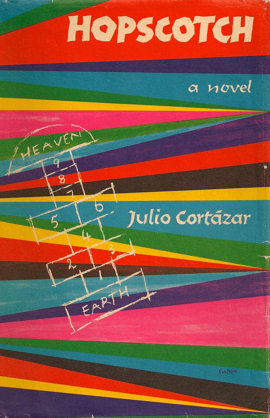
The image at the top of the page here, which was culled from the web, shows a first edition of Rayuela that was sold at auction recently. My own copy, a later reprint from 1973, bears only yellow lettering on the face, the multiple-color arrangement having been abandoned, no doubt for reasons of economy.
George Salter, a well-known graphic artist, designed the Pantheon edition shown above, issued in the United States in April 1966 in a translation by Gregory Rabassa. The title and author's name are hand-lettered. Salter made use of a hopscotch drawing very similar to the one on the Sudamericana cover, but tilted it at an angle, and then underlaid it with a series of colorful diagonal bands. (It was a bit of a cliché at the time for American publishers to use striking colors for books with Latin American themes.) The pattern continues onto the spine, but the back cover is taken up by a photo of a very young looking Cortázar. I'm quite fond of this cover, perhaps because I first read the novel in this edition, but Cortázar firmly disliked it. When he received the advance copies he told Porrúa “the dust jacket is horrendous, but as soon as you toss it in the trash the rest is a wonder of a book.”

This Signet edition of the novel was the first American paperback publication, in December 1967. I don't know if the cover art depicts an actual George Segal sculpture or just an imitation of his style; in any case the book credits neither the designer nor the artist. It's a fairly generic piece of art; perhaps the salient point is that the woman is naked and lying in bed, as the publishers were apparently eager to punch up the erotic angle of the book. The words above the title read LIFE | LOVE | SEX, which I suppose is one way of summing up what Rayuela is about. In case anyone missed the point it's spelled out again on the bottom of the back cover: “Hopscotch / a game of / LIFE, LOVE, SEX.” The blurbs are pretty hilarious: Harvey L. Johnson of the Houston Post promises “Sexual bouts, drunken orgies … escapes into hallucinations and trances, emphasis on sex, unmindful frankness … shocking and sordid … crude or amusing … Hopscotch will not soon be forgotten,” while the Baltimore Sun simply promises that it “leaves you limp.”

The Avon Books edition, first issued in 1975, is another story entirely. The entire Bard series of Latin American literature was elegantly and imaginitively designed, and this one, which was created by Roger Stine, is one of the better ones. As with the rest of the series, the title, author, and front blurb are separated from the illustration, printed in block letters, and hence very easy to read, even from a distance. I'm not sure whether the man looking down — who bears a rough resemblance to Cortázar — is meant to literally have one foot in Paris and the other in Argentina (which would make perfect sense), or whether the whole night scene is supposed to be Paris. (The artist has included the Eiffel Tower in the background, just to make sure we know that part of the book is set in Paris.) On the pavement, which may be cobblestone, is the familiar hopscotch grid, along with a young boy in short pants who is probably meant to represent a younger version of Horacio Oliveira. That last detail may be a little of a mistake; one thing Oliveira does not spend much time doing is reflecting on his childhood. But the boy is appropriately placed on the Earth of the hopscotch, looking ahead at Heaven or at his own future. The interplay of darkness and illumination is very appealing, particularly on the man's sweater, which seems to be lit by a flickering glow.

Above is the cover treatment used in the edition of the De Oro Library of Latin American and Latino Literature imprint of the Book-of-the-Month Club. The design is by Monica Elias; the painting is by the Argentine painter Xul Solar. It's a fairly handsome cover, though why it would be chosen for Hopscotch rather than for any other random modern novel that happened to be in need of a cover I'm not sure. One possible clue: the painting is called Homme des Serpents; a little nod, perhaps, to the novel's Club de la Serpiente?

Finally, above right is the current US edition in the Pantheon Modern Writers Series, which shares the same clean but rather drab design as the other volumes in that series. I suppose the woman in the photograph is meant to represent la Maga or Talita, but if so she seems miscast. Maybe she's Pola or Gekrepten.
(All translations from the Alfaguara edition of Cortázar's letters are my own.)